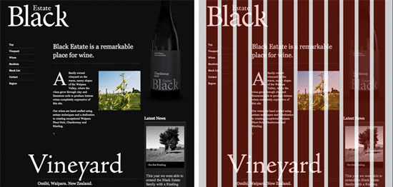
Grid System
Grid system consist of a series of
vertical and horizontal lines which cross and are then used to build solid form
and structure into your design. The grid divides a two-dimensional space into
smaller sections. Into grid sections the elements of design, like photography,
typography and illustration are placed. Then, these elements are adjusted and
fitted into the size of the grid section. Grid system provides you a solid base
that can help you to present your content in a much more readable, consistent
and accessible way. The grid system is used mainly by the graphic designers,
typographers, exhibition designers and photographers because it helps to solve
visual problems. Well structured and clear design will not only be read more
easily, but will also be better understood and remembered.
Designing
grid system:
1. To create a balanced grid we should
use the paper size as a guide. Most of the printed media uses the standardized
DIN system.
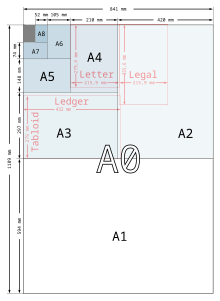
2. Then divide it into a grid

3. And start designing by filling up the
boxes with the images, type and other elements


Source:
http://markboulton.co.uk
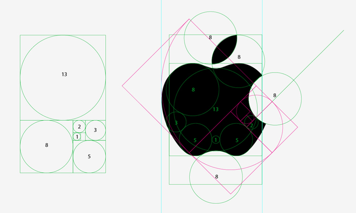
The Golden Ratio
It is the ratio that describes how one measurement relates
to another and is formed of 1:1.618.
It means that the ration of ab to bc is the same as ad to ab

If you divide each window again with the same ratio and link
their corner you end up with a spiral.


This spiral can be seen in nature as well as in art and
design throughout history.
Examples:

The Golden Ratio and Apple Logo:
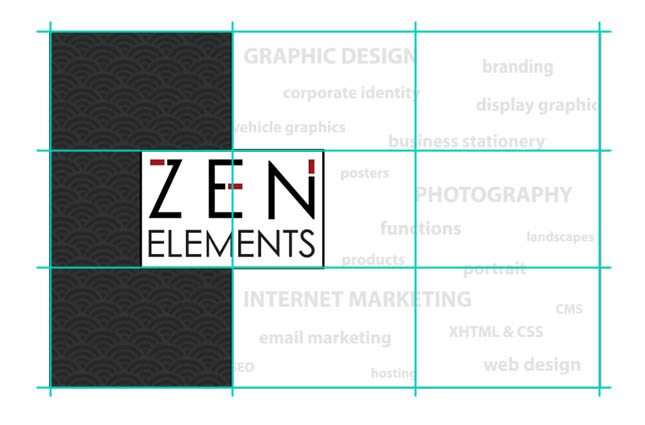
Rule of Thirds
It is a rule
which proposes that an visual image should be divided into nine equal parts by
two spaced horizontal lines and two spaced vertical lines and then an important
compositional factors should be positioned along these line or their
intersections.
Typography
It is the technique and art of arranging font. The words that make up typography are typo (types) and graphy (drawing). Typography is important because creates clear difference in content.
Typographic technicalities:
- Typeface should not distract attention from the transmission of the message, text.
- Format: the bottom of the page is less valuable, the top of the page holds the most attention, elements that are close to each other appear to belong together
Type classification:
- Serif - has cross-lines at the ends of strokes
- Sans Serif - no cross-lines
- Script and hand-lettered - hand lettering
Glyphic- letters carved in stone
- Blackletter - flat-pen hand-scripts
- Monospaced- each letter occupies the same space
- Display- less liable at text sizes
- Symbols - simple illustrations
Typographic measurements
1. The size of the type is measured in
points
2. Point size is the height of the font
( 1 inch = 72 points)
Typeface alphabets
-
Correct
spaces between letters and words.
-
Consistent
spacing makes reading easier
·
Letter-spacing
– the space between groups of words or characters, negative letter-spacing
pulls text closer together, positive letter-spacing pushes letters apart.
(Wide letters need more space than narrower letters and small letters need more space than longer letters
·
Measure
- the amount of space used by a column
of type that relates to the number of characters per line ( a single column of
text contains between 40-50 characters per line, multiply columns contain up to
80 characters per line)
·
Kerning
– the adjustment and the space between two characters that require a certain
look, for example “AV”
-
The
length and spacing of lines conductive to easy reading
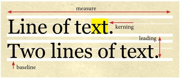
· Leading – line-spacing, space between lines of text
· Baseline –The horizontal line where text lines along
- Common type terminology

- The most commonly used type designs are Baskerville, Helvetica, Century
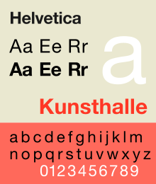
Helvetica
·
Designed
by Max Miedinger
·
Sans-serif
typeface
·
The
square dot over the letter “j” and “i”
·
Horizontal
or vertical cuts
·
Round
forms
Century
·
Designed
by L.B. Benton
·
Egyptian
typestyle
·
Often
used in textbooks
·
Curved
brackets
·
Square
Serif
Baskerville
· Designed by John Baskerville
· Softer typeface
· Contrast between thin and thick
· Round, bracket serifs
Alignment in Design

Alignment is
about organizing elements relative to a line or margin. Alignment is important
in design because it create a visual connection between related elements and
allows you to arrange them in a way that matches how people naturally read the
page.
Text alignments:
Left - each line is aligned to the left margin, and the right edge of each line is uneven. This alignment is mainly used for images with left-to-right text direction.
Center - text is aligned to the midpoint of the right and left text box margins, and both edges of each line are uneven.
Right - each line is aligned to the right margin, and the left edge of each line is uneven. This alignment is mainly used for images with right-to-left text direction.
Justified - the first and last characters of each line are aligned to the left and right margins. The lines are filled by adding space between and within words. The last line of the paragraph is aligned to the right margin if text direction is right-to-left or to the left margin if text direction is left-to-right.
Distribute All Lines The first and last characters of each line are aligned to the left and right margins. The lines are filled by adding the same amount from each character.
Idioms
Idioms are
phrases, words or expressions that are grammatically uncommon or their meaning
cannot be taken literally as they are metaphorically expressed. Examples:
Piece of
cake – something is very easy to do
Break a leg
–means good luck
Hit the
books – means to study
My Phrases and their origins
Black sheep - the least reputable
member of a group who doesn't fit into because their character is not good enough.
Origin
The phrase arose in the late 18th
century, probably from an older proverb, "There's a black sheep in every
flock." Black sheep, in those balmy pre-industrial
days, were not as valuable as white sheep. None of the sources was explicit,
but I presume white wool could be dyed into any color while black wool was more
limited. Thus, the black sheep was the unwelcome oddity in the flock.
Sourced : http://www.straightdope.com/columns/read/1947/whats-the-origin-of-the-expression-black-sheep
As white as snow – Pure white. It
symbolize the intensity of color on a bright winter’s day and also the purity
of untrodden snow.
Origin
Chaucer, Shakespeare and the Bible
all contain versions of white as snow. For example:
From Shakespeare's Hamlet, 1602:
... What if this cursed hand
Were thicker than itself with brother's blood,
Is there not rain enough in the sweet heavens
To wash it white as snow? ...
The King James Version of the Bible,
1611, has this in Daniel 7:9:
I beheld till the thrones were cast down, and
the Ancient of days did sit, whose garment was white as snow, and the hair of
his head like the pure wool: his throne was like the fiery flame, and his
wheels as burning fire.
Blonde bombshell – used to describe
an attractive, sexy woman.
Origin:
Popularized by a movie. In 1933, the
platinum blonde Jean Harlow was one of the most popular actresses in
Hollywood. That year, Harlow starred in
a movie called Bombshell (at the time “bombshell” in American slang was already
being used to refer to incredibly attractive, flamboyant women, with the first
documented case of this in 1860). One of the advertising lines for the
film was “Lovely, luscious, exotic Jean Harlow as the Blonde Bombshell of
filmdom.” When the film was released in England, they even renamed it “Blonde
Bombshell”.
Sourced: http://www.todayifoundout.com/index.php/2012/09/origin-of-the-phrase-blonde-bombshell/
Red tape - The collection of unnecessary
procedures and forms required to gain
bureaucratic approval for something
Origin:
Legal and official documents
have been bound with red tape since the 17th century and continue to be so. The
first reference to this practice is the 1696-1715 Maryland Laws:
"The Map upon the Backside
thereof sealed with his Excellency's Seal at Arms on a Red Cross with Red
Tape."
The first record of it being used in
that sense is from The pleader's guide, 1796. This spoof verse, purporting to
be the work of John Surrebutter (a deceased barrister) was a satire on the fussiness
of English law. It includes the lines:
Nor would the Fates... Cut the
red-tape of thy years.
This is part-way towards a
metaphorical usage of the term, albeit still clearly referring to actual
lawyer's red-tape. The first entirely figurative usage of 'red-tape' is Edward
Bulwer-Lytton in Alice, or the Mysteries, 1838:
"The men of more dazzling genius
began to sneer at the red-tape minister as a mere official manager of
details."
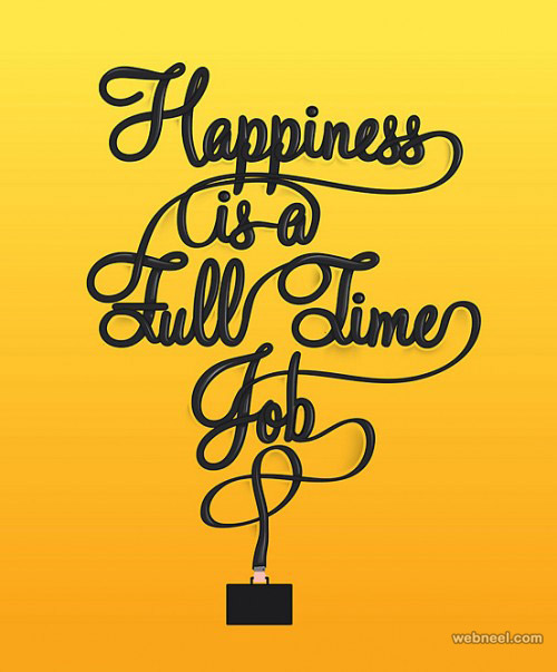
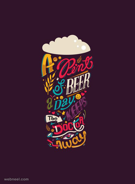
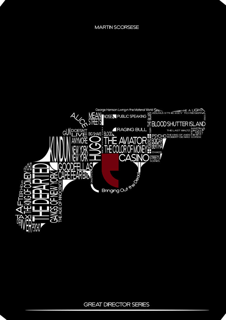
Inspirational designs